Key UX decisions
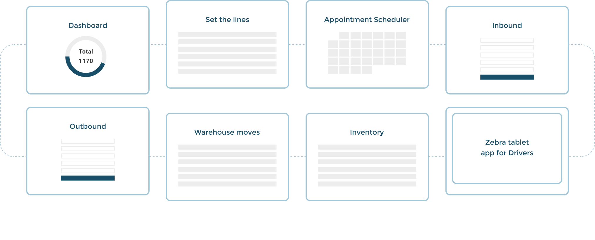
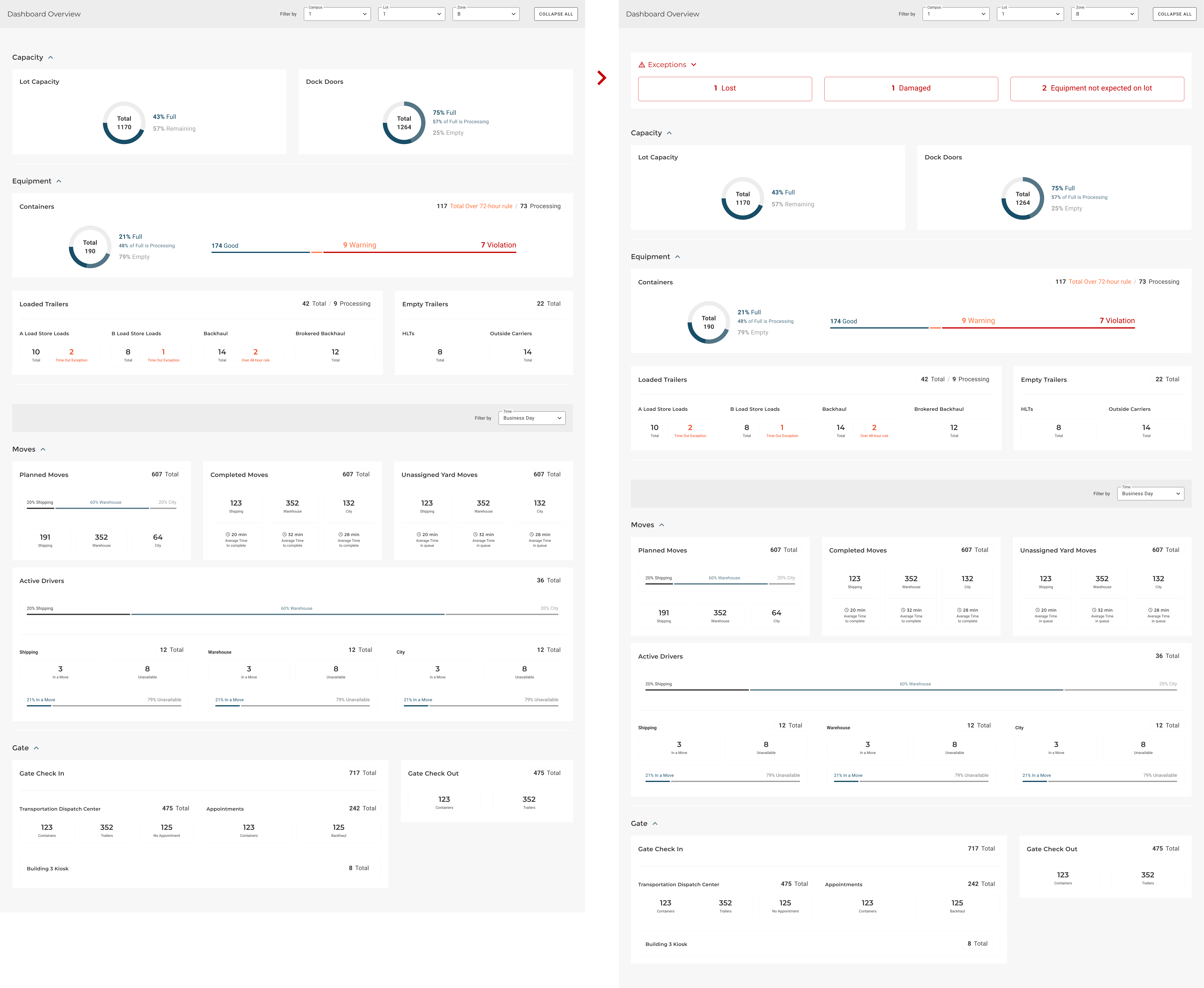
Dashboard
In the dashboard they had the complete movement's overview. They needed to see the alerts inmediately - if there's any. So we’ve showed the exceptions or errors that needed immediate action at the top. Like lost, damaged or equipment not expected in the lot and needed to be moved.
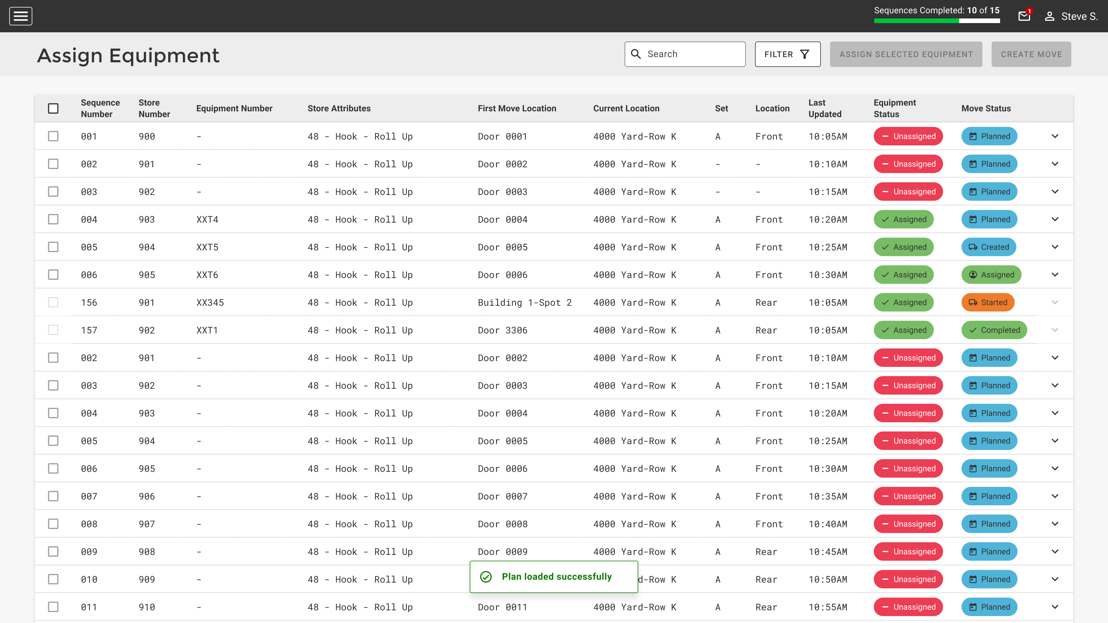
Assign and update equipments
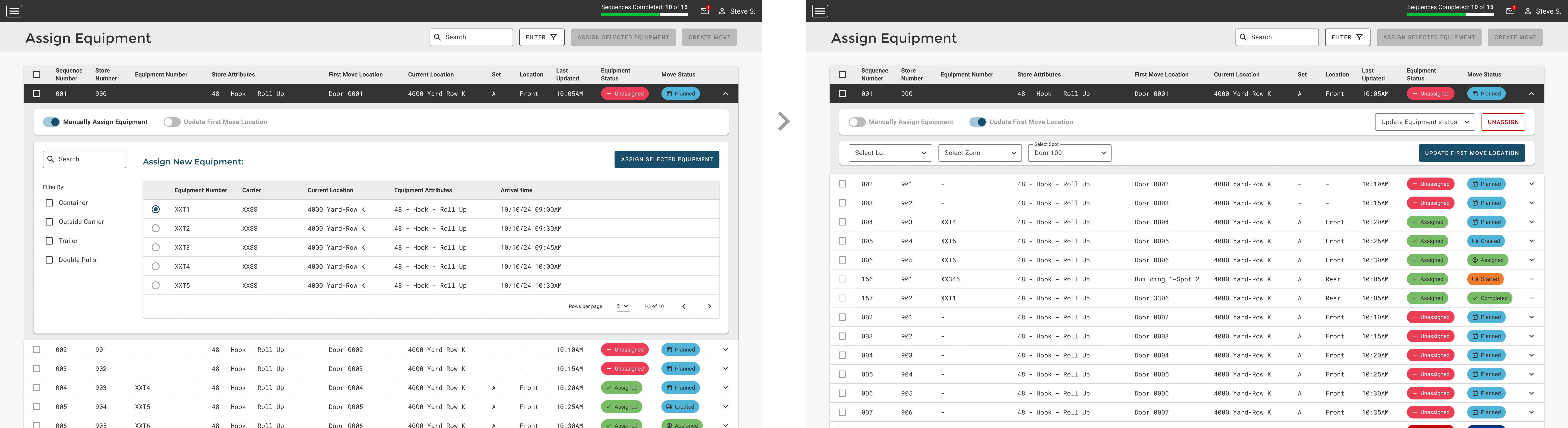
Each row has the ability to assign an equipment or Update the location, and they needed to read the table's list and compare the information while it was being shown, that's why we couldn't hide anything behind a side panel or modal. So we decided to open the option below the table's row to edit or complete the information from there.
The option to update the First move location is a secondary action because it's not usual. So we added a toggle which unselect the other option after it's selected. We discussed about using a radio button but they needed to make it more visible and obvious to the eye.
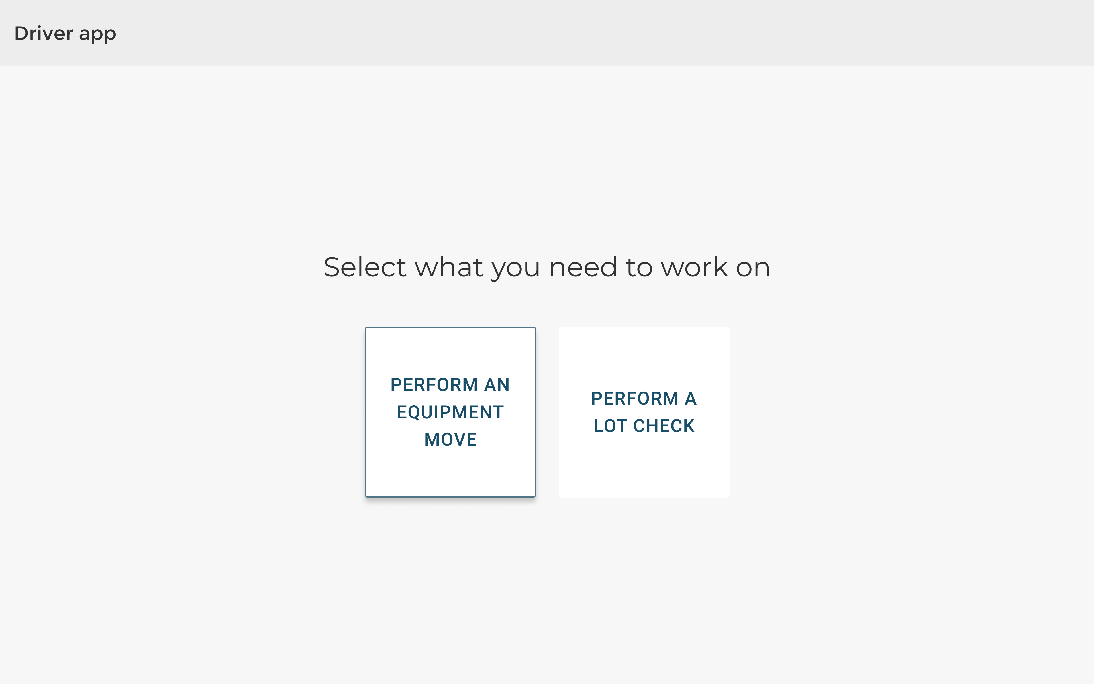
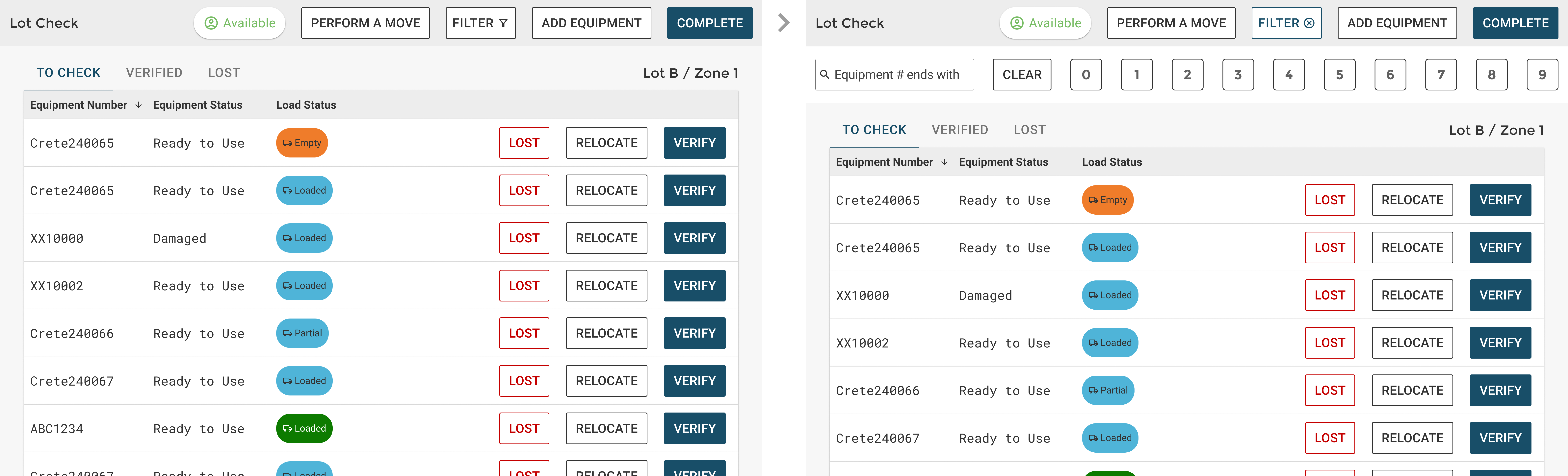
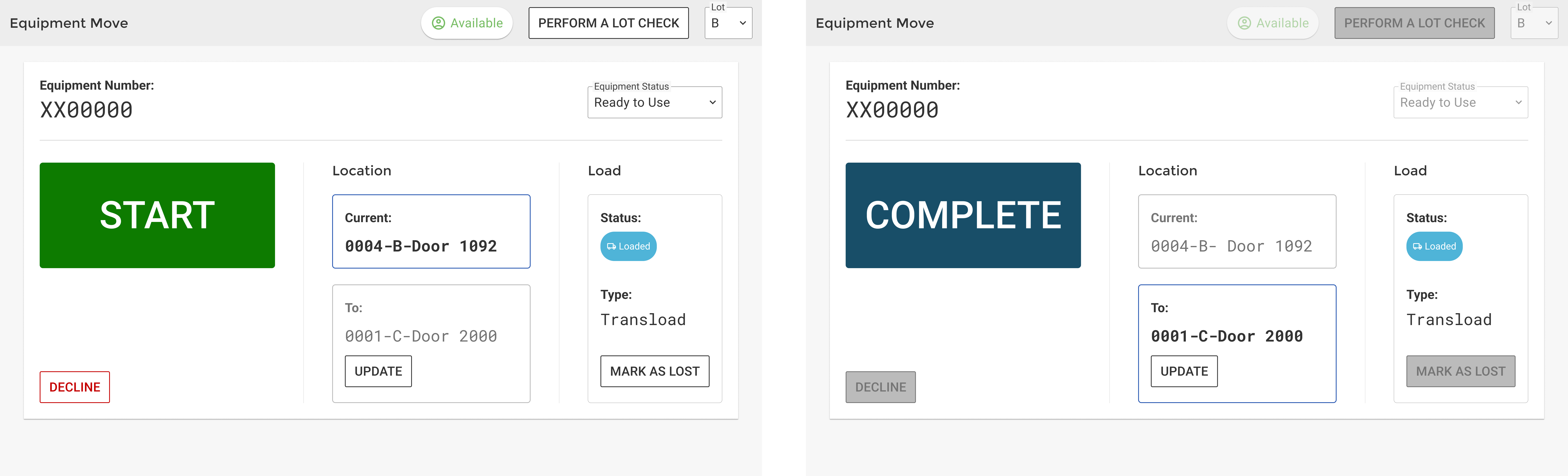
Drivers app
The drivers are able to see the assigned moves for them, status, update information about the move or trailer and set themself as available or unavailable to make the moves. As they were using it while they were transporting the trailers in this huge warehouse, the elements needed to be bigger and easy to read. Clear information but short (no long texts!) and big buttons and a modal confirmation in case they touch something by mistake.
We added a keyboard in the filter's search with the numbers they needed to look for, so we avoided them from opening the default keyboard which took a lot of space of the screen, hiding information.
The main action took a third of the screen and was moved to the left to avoid touching it by mistake because most users were right handed. Also we added a modal's message to confirm the action, just in case. And the next action needed to do was highlighted for them.
Design System + Handoff
General Design Decisions
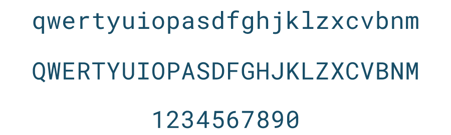
Roboto monospaced font was selected to show alphanumeric codes because it’s modular, keeping the same alignment, and all the characters are really easy to differentiate in order to avoid mistakes.
Angular Material
As they already had a system developed with Angular because it is an internal tool and they needed to build it fast, we offered them to use the existing Angular material DS customized with their brand colors and fonts.

Design system file
We downloaded the Angular Material DS, adapted it for them and then we gave them the Design system with the used components on the handoff. That made all our work with devs faster and cleaner.
We delivered the file adding only the customized components used in the apps (not the complete Angular Material elements) + the components for the Zebra tablet's app, which were addapted in order to improve the readibility.
Tokens and components were created from the beginning so it made our work faster and kept the design consistency and improved the Front end development.
Dark Mode
The use of the dark mode was key because the users could be working inside the warehouses or outside under the sunlight.
Keeping in mind that we didn't have much time to build it, I proposed to the dev team to use the new Figma tools to create the dark mode so the designs were automatically updated after changing them to dark mode and it was useful for the dev team too, providing them the CSS code.
You can check below how it's updated on Figma after the DS library is all setted:
Status system
The status chips were the most important information that they needed to see at first glance, and also those were present through all the app. So we created a system and documented all the different Status: by type (Load, Processing, Door, Move, appointment and arrival), in which app were they used and each use explanation.
We used the colors that the client already was using to keep consistency, but ensuring that all items met AA accessibility standards.
Results
"It has improved everyone's workflow - from the scheduler to drivers. In fact, it was such an improvement that the drivers felt empowered enough to make a couple of small suggestions to make it even better. They felt like enough care was taken originally that they would be listened to when offering these suggestions."
"The project was so successful that they are using your work as a baseline for a new similar project. They are using your design system and workflow to accelerate their work. In fact, that was one thing that the client praised so much. He said that his team learned so much from you and the Design Lead, and it made his team better designers."
Note: The project's manager provided us these results one year after the apps were launched.
Thank you!